UK offshore wind capacity factors

Posted by – 2022/06/19

Here are the average capacity factors for offshore wind farms in UK waters, newly updated to include data to the end of May 2022 (though there are still some figures to come through for the most recent couple of months, but only for the smaller windfarms). There are 40 operational windfarms presented here, and three closed demonstration sites.

2020 set a new record for the highest annual average capacity factor for a UK offshore windfarm: Hywind Scotland achieved 57.1% in the twelve months to March 2020. This floating windfarm, has behaved differently to any windfarm we’ve seen before, and that’s best portrayed in its load duration curve. The load-duration curves at the bottom of this page show the differences in distribution of outputs: click on the individual farm names in the legend, to toggle the display of individual curves.

You might be interested in comparing these with the capacity factors and load-duration curves for Belgium, Denmark and Germany.

Read more…

Renewables in the electricity grid: country-by-country penetrations in 2019

Posted by – 2022/03/09

The International Renewable Energy Agency provide a huge amount of data on renewables around the world. Here’s a summary of their 2019 data on renewable electricity generation.

CountryTotal electricity (GWh)% solar% wind% hydro% other renewables% all renewables% nuclear% other
Afghanistan1.43.6%0.0%83.2%0.0%86.8%0.0%13.2%
Albania5.20.4%0.0%99.6%0.0%100.0%0.0%0.0%
Algeria81.50.8%0.0%0.2%0.0%1.0%0.0%99.0%
American Samoa0.22.9%0.0%0.0%0.0%2.9%0.0%97.1%
Andorra0.10.6%0.0%75.5%19.0%95.1%0.0%4.9%
Angola17.80.1%0.0%70.7%1.1%71.9%0.0%28.1%
Anguilla0.12.4%0.0%0.0%0.0%2.4%0.0%97.6%
Antigua and Barbuda0.25.8%0.0%0.0%0.0%5.8%0.0%94.2%
Argentina132.20.6%3.8%26.8%1.6%32.8%6.0%61.2%
Armenia7.60.3%0.0%31.0%0.0%31.4%28.8%39.9%
Aruba1.01.1%14.2%0.0%0.0%15.4%0.0%84.6%
Australia264.05.6%6.7%6.0%1.3%19.7%0.0%80.3%
Austria74.22.3%10.1%59.0%6.4%77.8%0.0%22.2%
Azerbaijan26.10.2%0.4%6.0%0.8%7.3%0.0%92.7%
Bahamas2.00.1%0.0%0.0%0.0%0.1%0.0%99.9%
Bahrain17.90.0%0.0%0.0%0.0%0.1%0.0%99.9%
Bangladesh80.60.4%0.0%1.0%0.0%1.4%0.0%98.6%
Barbados1.23.8%0.0%0.0%0.0%3.8%0.0%96.2%
Belarus40.50.4%0.4%0.9%0.8%2.5%0.0%97.5%
Belgium93.74.5%10.4%1.3%5.6%21.8%46.4%31.8%
Belize0.42.4%0.0%18.1%39.7%60.2%0.0%39.8%
Benin1.30.4%0.0%0.0%0.0%0.4%0.0%99.6%
Bhutan8.90.0%0.0%100.0%0.0%100.0%0.0%0.0%
Bolivia (Plurinational State of)10.21.8%0.7%31.8%2.1%36.4%0.0%63.6%
Bonaire, Sint Eustatius and Saba0.16.3%22.4%0.0%0.0%28.7%0.0%71.3%
Bosnia and Herzegovina17.50.2%1.5%35.3%0.0%37.0%0.0%63.0%
Botswana3.30.2%0.0%0.0%0.0%0.2%0.0%99.8%
Brazil626.31.1%8.9%63.5%8.8%82.3%2.6%15.1%
British Virgin Islands0.30.1%0.4%0.0%0.0%0.5%0.0%99.5%
Brunei Darussalam4.50.0%0.0%0.0%0.0%0.0%0.0%100.0%
Bulgaria44.33.3%3.0%7.6%4.1%18.0%37.4%44.7%
Burkina Faso0.812.9%0.0%13.2%0.2%26.2%0.0%73.8%
Burundi0.32.4%0.0%72.1%1.7%76.2%0.0%23.8%
Cabo Verde0.42.0%16.6%0.0%0.0%18.7%0.0%81.3%
Cambodia8.71.4%0.0%46.2%1.2%48.8%0.0%51.2%
Cameroon6.40.3%0.0%79.2%0.0%79.5%0.0%20.5%
Canada645.40.6%5.1%58.8%1.7%66.2%15.7%18.1%
Cayman Islands0.82.3%0.0%0.0%0.0%2.3%0.0%97.7%
Central African Republic0.10.3%0.0%96.0%0.0%96.3%0.0%3.7%
Chad0.30.1%2.7%0.0%0.0%2.8%0.0%97.2%
Chile83.67.7%5.9%25.6%5.4%44.6%0.0%55.4%
China7504.53.0%5.4%17.4%1.1%26.9%4.6%68.5%
Chinese Taipei274.21.5%0.7%3.2%0.7%6.1%11.8%82.1%
Colombia80.10.2%0.1%68.0%2.2%70.5%0.0%29.5%
Comoros0.10.0%0.0%0.0%0.0%0.0%0.0%100.0%
Congo2.60.0%0.0%39.9%0.0%40.0%0.0%60.0%
Cook Islands0.034.8%0.0%0.0%0.0%34.8%0.0%65.2%
Costa Rica11.40.5%15.8%68.8%14.0%99.2%0.0%0.8%
Côte d'Ivoire10.60.1%0.0%32.7%0.0%32.8%0.0%67.2%
Croatia12.80.7%11.5%46.5%7.6%66.2%0.0%33.8%
Cuba20.90.8%0.5%0.6%2.5%4.4%0.0%95.6%
Curaçao0.82.4%24.7%0.0%0.0%27.2%0.0%72.8%
Cyprus5.14.2%4.6%0.0%1.1%10.0%0.0%90.0%
Czechia87.02.7%0.8%3.6%5.8%12.9%34.8%52.4%
Democratic People's Republic of Korea23.90.2%0.0%46.1%0.0%46.3%0.0%53.7%
Democratic Republic of the Congo10.00.3%0.0%98.7%0.0%98.9%0.0%1.1%
Denmark29.53.3%54.7%0.1%20.2%78.2%0.0%21.8%
Djibouti0.60.1%0.0%0.0%0.0%0.1%0.0%99.9%
Dominica0.10.2%0.6%21.4%0.0%22.3%0.0%77.7%
Dominican Republic21.01.7%3.7%5.1%1.6%12.1%0.0%87.9%
Ecuador32.30.1%0.3%76.4%1.4%78.1%0.0%21.9%
Egypt200.10.7%1.5%6.6%0.2%9.0%0.0%91.0%
El Salvador6.18.3%0.0%25.1%37.8%71.2%0.0%28.8%
Equatorial Guinea1.10.0%0.0%11.9%0.0%11.9%0.0%88.1%
Eritrea0.58.3%0.4%0.0%0.0%8.8%0.0%91.2%
Estonia7.61.0%9.0%0.2%17.9%28.1%0.0%71.9%
Eswatini0.40.3%0.0%54.5%44.9%99.8%0.0%0.2%
Ethiopia14.60.1%5.8%93.8%0.2%100.0%0.0%0.0%
Falkland Islands (Malvinas)0.00.3%34.4%0.0%0.0%34.7%0.0%65.3%
Faroe Islands0.40.0%13.6%26.8%0.0%40.4%0.0%59.6%
Fiji1.21.0%0.3%45.8%7.2%54.3%0.0%45.7%
Finland68.60.2%8.8%18.1%19.4%46.4%34.8%18.8%
France570.82.1%6.1%10.8%1.6%20.6%69.9%9.5%
French Guiana1.05.2%0.0%42.6%1.4%49.3%0.0%50.7%
French Polynesia0.75.8%0.0%23.1%0.0%28.9%0.0%71.1%
Gabon1.80.1%0.0%53.8%0.1%54.0%0.0%46.0%
Gambia0.40.9%0.0%0.0%0.0%0.9%0.0%99.1%
Georgia11.90.0%0.7%75.3%0.0%76.0%0.0%24.0%
Germany609.17.6%20.7%4.2%8.3%40.8%12.3%46.9%
Ghana18.30.5%0.0%39.7%0.1%40.4%0.0%59.6%
Greece45.59.7%16.0%8.9%0.9%35.5%0.0%64.5%
Greenland0.50.0%0.0%79.0%0.0%79.1%0.0%20.9%
Grenada0.21.5%0.1%0.0%0.0%1.6%0.0%98.4%
Guadeloupe1.75.9%3.6%2.6%10.0%22.2%0.0%77.8%
Guam1.73.9%0.0%0.0%0.0%4.0%0.0%96.0%
Guatemala12.22.0%2.7%35.8%28.2%68.7%0.0%31.3%
Guinea2.11.0%0.0%62.4%0.0%63.4%0.0%36.6%
Guinea-Bissau0.04.8%0.0%0.0%0.0%4.8%0.0%95.2%
Guyana1.11.1%0.0%0.0%7.2%8.3%0.0%91.7%
Haiti1.10.4%0.0%8.8%0.0%9.2%0.0%90.8%
Honduras12.39.1%6.7%19.8%16.7%52.2%0.0%47.8%
Hungary34.24.4%2.1%0.6%6.6%13.7%47.7%38.6%
Iceland19.50.0%0.0%69.1%30.9%100.0%0.0%0.0%
India1591.12.8%3.9%9.4%1.3%17.4%2.5%80.1%
Indonesia294.70.0%0.0%7.2%8.9%16.1%0.0%83.9%
Iran (Islamic Republic of)254.30.2%0.2%5.9%0.0%6.4%2.9%90.7%
Iraq88.00.4%0.0%5.6%0.0%6.1%0.0%93.9%
Ireland30.90.1%32.4%3.7%2.8%38.9%0.0%61.1%
Israel72.54.2%0.4%0.0%0.1%4.7%0.0%95.3%
Italy293.98.1%6.9%16.4%8.7%40.1%0.0%59.9%
Jamaica4.91.8%5.5%3.2%2.5%13.0%0.0%87.0%
Japan1045.06.6%0.7%8.3%2.9%18.6%6.1%75.3%
Jordan21.09.9%4.3%0.1%0.0%14.3%0.0%85.7%
Kazakhstan106.90.9%0.7%9.3%0.0%11.0%0.0%89.0%
Kenya11.70.7%0.2%31.5%47.3%79.7%0.0%20.3%
Kiribati0.013.6%0.0%0.0%0.0%13.6%0.0%86.4%
Kosovo6.40.2%1.4%3.4%0.0%4.9%0.0%95.1%
Kuwait75.10.1%0.0%0.0%0.0%0.1%0.0%99.9%
Kyrgyzstan15.10.0%0.0%91.7%0.0%91.7%0.0%8.3%
Lao People's Democratic Republic19.60.1%0.0%96.5%0.2%96.8%0.0%3.2%
Latvia6.40.0%2.4%32.7%14.4%49.6%0.0%50.4%
Lebanon12.00.9%0.1%6.9%0.2%8.1%0.0%91.9%
Lesotho0.50.2%0.0%99.8%0.0%99.9%0.0%0.1%
Liberia0.21.6%0.0%55.0%0.0%56.6%0.0%43.4%
Libya34.20.0%0.0%0.0%0.0%0.0%0.0%100.0%
Lithuania4.02.3%37.8%23.9%13.4%77.3%0.0%22.7%
Luxembourg1.96.8%14.7%49.8%14.6%85.9%0.0%14.1%
Madagascar1.91.2%0.0%47.9%0.0%49.1%0.0%50.9%
Malawi1.92.5%0.0%71.9%2.9%77.3%0.0%22.7%
Malaysia176.00.3%0.0%14.7%1.4%16.4%0.0%83.6%
Maldives0.72.7%0.3%0.0%0.0%3.0%0.0%97.0%
Mali2.91.1%0.0%59.3%0.0%60.4%0.0%39.6%
Malta2.110.2%0.0%0.0%0.3%10.5%0.0%89.5%
Marshall Islands0.12.3%0.0%0.0%0.0%2.3%0.0%97.7%
Martinique1.55.5%3.0%0.0%16.1%24.7%0.0%75.3%
Mauritania1.015.0%12.9%0.0%0.0%27.9%0.0%72.1%
Mauritius3.24.0%0.5%3.0%14.2%21.7%0.0%78.3%
Mayotte0.35.0%0.0%0.0%0.0%5.0%0.0%95.0%
Mexico331.32.2%5.0%7.1%2.5%16.9%3.6%79.5%
Micronesia (Federated States of)0.14.7%0.0%2.0%0.0%6.6%0.0%93.4%
Mongolia6.91.7%6.7%1.3%0.0%9.6%0.0%90.4%
Montenegro3.40.2%8.5%47.5%0.0%56.2%0.0%43.8%
Montserrat0.00.0%0.0%0.0%0.0%0.0%0.0%100.0%
Morocco40.44.0%11.7%4.1%0.1%19.8%0.0%80.2%
Mozambique15.60.0%0.0%95.0%0.4%95.4%0.0%4.6%
Myanmar25.70.3%0.0%50.2%1.0%51.5%0.0%48.5%
Namibia1.819.1%1.0%70.9%0.0%91.0%0.0%9.0%
Nauru0.03.5%0.0%0.0%0.0%3.5%0.0%96.5%
Nepal5.71.3%0.0%98.7%0.0%100.0%0.0%0.0%
Netherlands121.14.4%9.5%0.1%4.8%18.8%3.2%78.0%
New Caledonia3.33.5%1.7%8.5%0.0%13.7%0.0%86.3%
New Zealand44.80.3%5.0%57.1%19.3%81.7%0.0%18.3%
Nicaragua4.60.6%15.9%4.9%35.4%56.8%0.0%43.2%
Niger0.65.9%0.0%0.0%0.0%5.9%0.0%94.1%
Nigeria33.60.1%0.0%25.1%0.1%25.3%0.0%74.7%
Niue0.013.8%0.0%0.0%0.0%13.8%0.0%86.2%
Norway135.40.1%4.1%93.4%0.2%97.7%0.0%2.3%
Oman38.30.0%0.0%0.0%0.0%0.0%0.0%100.0%
Pakistan137.90.8%2.0%26.1%2.0%30.9%6.9%62.2%
Palau0.12.7%0.0%0.0%0.0%2.7%0.0%97.3%
Panama11.62.5%6.3%44.0%0.5%53.2%0.0%46.8%
Papua New Guinea2.10.1%0.0%42.0%21.2%63.3%0.0%36.7%
Paraguay49.60.0%0.0%99.7%0.3%100.0%0.0%0.0%
Peru56.61.5%2.9%55.5%0.8%60.8%0.0%39.2%
Philippines106.21.2%1.0%7.6%11.1%20.9%0.0%79.1%
Poland164.00.4%9.2%1.6%4.7%16.0%0.0%84.0%
Portugal53.22.6%25.7%19.3%6.7%54.3%0.0%45.7%
Puerto Rico18.91.3%0.8%0.2%0.1%2.4%0.0%97.6%
Qatar50.00.0%0.0%0.0%0.2%0.2%0.0%99.8%
Republic of Korea581.52.2%0.5%1.1%1.5%5.3%25.1%69.6%
Republic of Moldova3.80.1%1.1%7.9%0.8%10.0%0.0%90.0%
Republic of North Macedonia5.90.4%1.7%19.8%0.9%22.9%0.0%77.1%
Réunion3.08.5%0.4%13.7%8.6%31.2%0.0%68.8%
Romania59.63.0%11.4%26.8%0.8%42.0%18.9%39.0%
Russian Federation1121.50.1%0.0%17.6%0.0%17.8%18.6%63.6%
Rwanda0.85.5%0.0%48.3%0.3%54.1%0.0%45.9%
Saint Barthélemy0.10.0%0.0%0.0%0.0%0.0%0.0%100.0%
Saint Kitts and Nevis0.21.3%3.2%0.0%0.0%4.5%0.0%95.5%
Saint Lucia0.40.8%0.0%0.0%0.0%0.8%0.0%99.2%
Saint Martin (French Part)0.10.6%0.0%0.0%0.0%0.6%0.0%99.4%
Saint Pierre and Miquelon0.10.0%0.0%0.0%0.0%0.0%0.0%100.0%
Saint Vincent and the Grenadines0.21.9%0.0%15.7%0.0%17.6%0.0%82.4%
Samoa0.214.0%0.1%29.2%0.0%43.3%0.0%56.7%
Sao Tome and Principe0.10.4%0.0%5.8%0.0%6.2%0.0%93.8%
Saudi Arabia359.70.2%0.0%0.0%0.0%0.2%0.0%99.8%
Senegal2.39.9%0.0%0.0%4.9%14.8%0.0%85.2%
Serbia37.60.0%2.4%27.1%0.4%29.9%0.0%70.1%
Seychelles0.41.2%1.7%0.0%0.0%2.9%0.0%97.1%
Sierra Leone0.31.9%0.0%72.5%1.2%75.6%0.0%24.4%
Singapore54.10.5%0.0%0.0%3.6%4.2%0.0%95.8%
Slovakia28.42.1%0.0%16.1%6.0%24.1%53.7%22.1%
Slovenia16.11.9%0.0%29.1%1.6%32.6%36.2%31.3%
Solomon Islands0.13.3%0.0%0.9%2.6%6.8%0.0%93.2%
Somalia0.43.0%1.7%0.0%0.0%4.7%0.0%95.3%
South Africa223.23.0%0.1%2.6%0.2%5.9%5.8%88.3%
South Georgia and the South Sandwich Islands0.00.0%0.0%98.9%0.0%98.9%0.0%1.1%
South Sudan0.60.2%0.0%0.0%0.0%0.2%0.0%99.8%
Spain273.25.5%20.4%9.8%2.0%37.8%21.4%40.9%
Sri Lanka16.02.2%2.2%30.1%0.4%34.8%0.0%65.2%
State of Palestine0.814.8%0.0%0.0%0.0%14.8%0.0%85.2%
Sudan16.80.1%0.0%60.6%0.6%61.4%0.0%38.6%
Suriname1.90.7%0.0%50.6%0.3%51.6%0.0%48.4%
Sweden168.40.4%11.8%38.8%7.7%58.7%39.3%2.0%
Switzerland73.53.0%0.2%55.8%2.6%61.5%36.0%2.6%
Syrian Arab Republic26.80.0%0.0%2.8%0.1%3.0%0.0%97.0%
Tajikistan20.90.0%0.0%92.8%0.0%92.8%0.0%7.2%
Thailand197.72.6%1.9%3.5%16.2%24.1%0.0%75.9%
Timor-Leste0.60.2%0.0%0.2%0.0%0.4%0.0%99.6%
Togo0.61.3%0.0%31.5%0.0%32.9%0.0%67.1%
Tokelau0.092.1%0.0%0.0%0.0%92.1%0.0%7.9%
Tonga0.110.0%2.0%0.0%0.0%12.0%0.0%88.0%
Trinidad and Tobago9.20.1%0.0%0.0%0.0%0.1%0.0%99.9%
Tunisia22.11.2%2.3%0.3%0.0%3.7%0.0%96.3%
Turkey303.93.0%7.2%29.2%4.1%43.5%0.0%56.5%
Turkmenistan23.70.0%0.0%0.0%0.0%0.0%0.0%100.0%
Turks and Caicos Islands0.30.6%0.0%0.0%0.0%0.6%0.0%99.4%
Tuvalu0.023.3%0.0%0.0%0.0%23.3%0.0%76.7%
Uganda4.52.6%0.0%89.0%6.1%97.7%0.0%2.3%
Ukraine155.12.4%1.4%5.1%0.3%9.1%53.5%37.3%
United Arab Emirates138.52.7%0.0%0.0%0.0%2.7%0.0%97.3%
United Kingdom of Great Britain and Northern Ireland322.84.0%19.9%2.4%11.6%37.9%17.4%44.7%
United Republic of Tanzania7.90.6%0.0%32.3%1.9%34.8%0.0%65.2%
United States of America4391.82.2%6.8%7.1%1.9%17.9%19.2%62.9%
United States Virgin Islands0.71.0%0.0%0.0%0.0%1.1%0.0%98.9%
Uruguay16.12.6%29.5%50.4%15.5%98.1%0.0%1.9%
Uzbekistan57.50.0%0.0%11.2%0.0%11.2%0.0%88.8%
Vanuatu0.18.3%7.3%9.5%1.7%26.8%0.0%73.2%
Venezuela (Bolivarian Republic of)25.60.0%0.3%59.1%0.0%59.5%0.0%40.5%
Viet Nam227.92.1%0.2%40.6%0.2%43.1%0.0%56.9%
Yemen5.313.8%0.0%0.0%0.0%13.8%0.0%86.2%
Zambia15.00.1%0.0%82.2%0.5%82.8%0.0%17.2%
Zimbabwe9.40.2%0.0%57.8%2.7%60.7%0.0%39.3%
  • Comments Closed

Capacity factors and load-duration curves for Belgian offshore windfarms

Posted by – 2021/03/01

Previously I’ve provided capacity factors for Danish, German and UK offshore windfarms. Now here are the numbers for the larger of the Belgian offshore windfarms. The ones shown here are the only ones I’ve been able to get detailed data for, so far.

Belgian offshore wind

All numbers are to the end of December 2020. Analysis by EnergyNumbers.info.Latest
rolling
12-month
capacity
factor
Lifetime
capacity
factor
Age (y)Installed
capacity
(MW)
Total
elec. gen.
(GWh)
Power per
unit area
spanned (W/m2)
Rolling 12-month
capacity factors
Belwind39.6%37.9%10.11653 2064.7Belwind
Nobelwind46.7%44.1%3.61652 2793.3Nobelwind
Norther45.4%42.7%1.63702 1984.1Norther
Northwester 236.6%0.6219447
Northwind43.9%41.6%6.52164 6016.5Northwind
Rentel41.3%39.0%2.03092 1175.2Rentel
Thorntonbank NE32.9%32.4%7.91592 6374.7Thorntonbank NE
Thorntonbank SW39.5%36.8%7.31753 2985.0Thorntonbank SW
Total42.0%31.4%177820 7824.6

Load duration curves

I’ve constructed for each of the offshore windfarms for which there is sufficient detailed hourly data (this will usually mean at least a year’s worth). Use the pause and play buttons to stop and start the sequential display of curves. Click on the windfarm name in the legend to toggle the display of that farm’s curve.

Methodology

Note that for each individual windfarm, its curve is based on data starting from the date that the windfarm was fully commissioned, or from 1 Jan 2015, whichever is later: data is only available from 2015 onwards. The windfarm’s age is calculated from the date it was fully commissioned.

The Thornton Bank windfarm was built out in three phases, I-II-III. However, the hourly data is broken down into two groups, SW and NE. As you can see from this map, courtesy of 4COffshore, most of phase II is in the NE section. The SW section contains the rest of phase II, as well as all of phases I and III.

My thanks to Rémi_C2W on Twitter for solving the mystery of the Northwind time-series in the ENTSOE data: he worked out that the reported data is the sum of output from both Northwind and Nobelwind: so the real Northwind output could be calculated by subtracting the reported Nobelwind output from it. ENTSOE have now fixed this, so this transformation is no longer needed.

  • Comments Closed

Germany’s offshore wind capacity factors

Posted by – 2020/02/01

Previously I’ve provided the figures for Danish offshore windfarms, for the UK , and for Belgium too. Here are the numbers for the larger German offshore windfarms. The ones shown here are the only ones I’ve been able to get detailed data for, so far, so updates here will be restricted. If you know of additional data sources, in particular for BARD Offshore 1, for which I no longer have a live supply, please let me know on Twitter.

German offshore wind capacity factors

All numbers are to the end of 2019. Analysis by EnergyNumbers.info.Latest
rolling
12-month
capacity
factor
Lifetime
capacity
factor
Age (y)Installed
capacity
(MW)
Total
elec. gen.
(GWh)
Power per
unit area
spanned (W/m2)
Rolling 12-month
capacity factors
Albatros1.2%0.21121
Amrumbank West44.9%44.0%4.23024 7604.0Amrumbank West
Arkona52.7%0.2385301
Baltic 1&247.0%45.9%4.23365 6664.2Nordsee Ost 1
Bard Offshore 134.5%2.74001 6792.3Nordsee Ost 2
Borkum Riffgrund I37.2%38.5%4.23124 4673.3Bard Offshore 1
Borkum Riffgrund II30.8%30.5%1.24501 4033.8Baltic 1&2
DanTysk51.6%50.3%4.72885 2852.2Borkum Riffgrund I
Gode Wind I45.2%41.7%2.63303 1163.4Borkum Riffgrund II
Gode Wind II44.6%41.3%2.62522 3783.5DanTysk
Hohe See42.4%0.2497344
Nordsee One34.4%32.0%2.03311 8723.0Sandbank
Nordsee Ost 136.2%35.6%4.71442 0662.8Gode Wind I
Nordsee Ost 235.0%35.8%4.71442 1042.9Gode Wind II
Sandbank53.5%50.3%3.02883 7353.1Nordsee One
Total36.9%38.7%457239 1783.1

Load duration curves

I’ve constructed for each of the offshore windfarms for which there is detailed hourly data. Use the pause and play buttons to stop and start the sequential display of curves. Click on the windfarm name in the legend to toggle the display of that farm’s curve.

Methodology

Note that for each individual windfarm, its curve is based on data starting from the date that the windfarm was fully commissioned, and the windfarm’s age is calculated as starting at that date. There is one exception: the Bard Offshore Windfarm was fully commissioned in August 2013, but detailed data on its generation is only available from spring 2017 onwards – so the “age” shown for this windfarm is the age of the oldest available data, not the age of the windfarm itself.

The numbers for DanTysk did look strange: I had to clean a stretch of five months of data that was clearly wrong. Hence, there’s a gap in the data for it. A small kink remains in its load duration curve; this may be an artefact of a small amount of remaining problematic data. There are smaller gaps in data for several of the windfarms, and I’m not yet sure how that missing data is distorting these curves.

Windfarms less than a year old are excluded from the calculations of the power density per unit area spanned. The figure for total power density is a weighted average of the windfarms that are a year older or more: this is weighted by size, but not by time. So a windfarm that’s twice as large contributes twice as much to the total; whereas a windfarm that’s twice as old, does not.

Germany’s renewables more than make up for its nuclear phase-out

Posted by – 2020/01/02

NEW updated with data for 2019 too.

Germany has been phasing out its nuclear power, as policy, since 1999. It’s also been expanding its renewable generation. The nuclear phase-out provides the renewables market with a clear, long-term positive signal. As does Germany’s commitment to decarbonisation.

I’ve previously written about German PV and German offshore wind capacity factors, Now, let’s take a look at how quickly the rollout of renewables has happened, relative to the decline of nuclear. The chart below Read more…

  • Comments Closed

Capacity factors at Danish offshore wind farms

Posted by – 2019/03/01

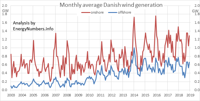
monthlygenHere are the average capacity factors of every Danish offshore wind farm, newly updated to include data to the end of 2018. Compare these with the capacity factors for German, and UK, and Belgian offshore wind farms.

Read more…

A plurality of wind: a landmark on the road to cleaner electricity

Posted by – 2016/01/11

On 17 December 2015 Britain passed a new landmark on the road to cleaner electricity: for four hours, from 03.00 to 07.00, the grid had a plurality of wind: wind was the largest generation type on the grid: there was more wind generation than generation in Britain from gas, or from coal, or from nuclear, or any other domestic source. That was the case for the four hours as a whole, and for each half-hour within that four-hour period.

Read more…

100% renewables: there’s more than enough space

Posted by – 2015/12/15

Is land area a barrier, or a significant constraint, to achieving 100% renewables?

Read more…

Another booming year for Chinese renewables

Posted by – 2015/01/17

From China’s 2014 energy statistics:

  • New renewable capacity outstripped new coal capacity;
  • additional output from renewables (the increase in output in 2014 over 2013) was greater than the total output from nuclear;
  • total generation from hydro, wind and solar all went up;
  • total generation from fossil thermal plant went down;
  • coal & gas consumption for electricity went down.

And so to the detail.

Half of the 104 GW of new capacity is renewables; 47 GW is thermal plant (predominantly coal and fossil gas) and 5 GW is nuclear. 22GW of the renewable capacity is hydro, 20 GW wind, and 11 GW solar.

I’ve updated this post on 2015-03-12 with the more specific statistics now available from China.

Generation from wind increased to 17.88GW (average electricity production) this year, from an estimated 16GW last year. Hydro generation increased by about 17% to 122 GW. China now has 27 GW of grid-connected solar capacity, and 20 GW of nuclear capacity.

Output from thermal (coal & gas) plants dropped in 2014, because although thermal plant capacity increased by 5.9%, this was outweighed by the relative decrease of 6.3% in its capacity factor (from 57.3% to 53.7%, an absolute change of -3.6%, which is a relative change of -6.3%). In addition, the efficiency of coal & gas plants went up, meaning that the consumption of coal & gas for electricity generation decreased in 2014.

Total electricity generation was about 632 GW, of which 476 GW was thermal, 122 GW was hydro, 17.8 GW was wind, 14.4 GW was nuclear, and 2.6 GW was solar.

So coal & gas generation decreased slightly; hydro generation increased by about 17 GW; solar generation increased by about 1 GW; and wind generation increased by about 2 GW; giving a net increase in renewables generation of about 20 GW.

Wind records in Britain

Posted by – 2015/01/01

It’s been a remarkable few months for wind generation in Britain, Feb 2014 – Jan 2015, and the last of those two months in particular. Several records were broken, and re-broken.

You can see the live British grid data, including wind generation, here; and here’s a version for mobiles (cellphones) and other small-screen devices.

February 2014 saw the highest monthly average metered wind power generation that Britain’s ever achieved: in that month, average generation from metered windfarms was 4.09 GW.

The half-hour starting at 06.00 on the morning of 18 October 2014 saw the highest percentage contribution of wind (penetration) to total demand: 23.5% from metered windfarms; 32.9% from all windfarms.

The half-hour starting at 19.30 on 9 December 2014 saw the highest half-hourly wind generation: 6.80 GW from metered windfarms; 9.42 GW from all windfarms.

And until January 2015, December 2014 also had the highest amount of wind-generated electricity of any month: 3.90 TWh (of which a record 2.85 TWh was from metered windfarms); and the highest monthly contribution from wind to total demand – 13.9% from all windfarms (the highest contribution from metered windfarms was 10.5%, in February 2014). But January 2015 outdid the preceeding month, with 14.4% of demand being met by metered and embedded wind; 4.13 TWh of wind in total, which was equivalent to an average power of 5.56 GW; and 2.95 TWh from the metered windfarms.

Records for electricity generation from wind in Britain

analysis by EnergyNumbers.infoAll windfarmsMetered windfarms only
MonthlyMax wind penetration14.4 %Jan 201510.5 %Feb 2014
Maximum energy4.13 TWhJan 20152.95 TWhJan 2015
Max average power5.56 GWJan 20154.09 GWFeb 2014
Half-hourlyMax wind penetration32.9 %2014-10-18 06.00-06.3023.5 %2014-10-18 06.00-06.30
Max average power9.42 GW2014-12-09 19.30-20.006.80 GW2014-12-09 19.30-20.00

(thanks to BMReports and Elexon for the raw data I used for this analysis)

What does the capacity factor of wind mean?

Posted by – 2014/09/29

Harald Pettersen/Statoil, NHD-INFO [CC-BY-2.0]
Sheringham Shoal offshore wind farm, photo by Harald Pettersen/Statoil, NHD-INFO [CC-BY-2.0]

The capacity factor is the average power generated, divided by the rated peak power. Let’s take a five-megawatt wind turbine. If it produces power at an average of two megawatts, then its capacity factor is 40% (2÷5 = 0.40, i.e. 40%).

To calculate the average power generated, just divide the total electricity generated, by the number of hours.

You can find the capacity factors for Danish offshore wind here; the capacity factors for UK offshore wind are here, and here are the capacity factors for German offshore wind.

You could do an equivalent calculation for a car. Let’s say your car’s top speed is Read more…

  • Comments Closed

Watching the ships (part 3): Humber Gateway and Westermost Rough offshore wind farms

Posted by – 2014/08/27

There are two windfarms being built right now near the mouth of the Humber Estuary: Humber Gateway and Westermost Rough.

Here’s a map of the ships serving the windfarms.
Read more…

Decarbonising the Irish grid

Posted by – 2014/01/01

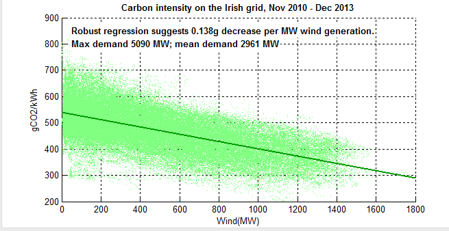
Following on from this question on the Sustainability Stack Exchange about decarbonisation in Eire, and a discussion on the Claverton Energy Group about the British and Irish grids, I took a quick look at the data on carbon intensity and wind generation in the Irish grid. This uses all the available data at time of writing – 38 months, from November 2008 to the end of December 2013.

Here’s the impact that its wind generation has on the carbon intensity of the grid: each MW of wind power that’s generating, reduces the carbon intensity of electricity by 0.138 gCO2/kWh: 1GW of generation reduces the carbon intensity by 138 gCO2/kWh. For context, average demand is about 2.9 GW, and peak demand is about 5 GW.

Scatter graph of wind generation and carbon intensity in Eire
I’ve used Robust regression, as there are some reporting errors in there (further cleaning has refined the estimate to 0.136 from 0.138).

The y-axis is baselined at 200 gCO2/kWh, because there’s very little real data below that line at present.

I note that Eirgrid has heat-curves for every thermal plant on the grid (which is how they calculate the carbon intensity). Does National Grid have anything like that for GB? Do you? Would you like to share them with me?

And re the data-cleaning – just in case anyone else downloads the wind forecast and generation data, note that every year on the last Sunday in October, the wind data for each of the four quarter-hours when the clocks go back is duplicated.

The UK is the Saudi Arabia of wind energy

Posted by – 2012/08/11

An article by Zoe Williams in The Guardian, towards the end of July 2012, began:

The UK is the Saudi Arabia of wind

Dale Vince of Ecotricity said the same thing back in 2011:

Mr. Vince continued by saying that the UK is the ‘Saudi Arabia’ of wind energy, which makes Britain a potential to become an independent producer of energy.

And back in October 2009, I said the same thing at the Claverton Energy Conference. Anyway, enough of the source of this: let’s look at the numbers.

2011 was something of a boom year for Saudi Arabian energy production. The Arab Spring uprisings resulted in reduced output from other countries, meaning Saudi Arabia could significantly boost production without trashing the oil price. So let’s use its 2011 production as our benchmark. From the OPEC Annual Statistical Bulletin 2012, and converting from millions of barrels of oil per year into gigawatts, and from millions of cubic feet of gas per day into gigawatts, we see that Saudi Arabia’s annual rate of energy production was just under 800GW. By comparison, in 2011, UK average final electricity demand was 36GW and total final energy demand (including all gas for heating, and all transport fuels) was 183GW.

So, as the chart above shows, the UK’s annual average offshore wind resource is somewhere between 1.5 times larger, and 11 times larger, than 2011 Saudi Arabian energy production. And the great thing is that the wind won’t run out. It will vary, at all scales from seconds to decades, but it won’t run out as long as the sun keeps shining.

My own earlier estimate (shown above as Smith 2011) of over two terawatts as the UK offshore wind resource is documented on the Claverton Energy website. Using the same method as described there, and considering all UK waters, the resource is given above as Smith (2012).

Stuart Gatley, in his Masters of Engineering thesis at the University of Nottingham, models a range of potential future scenarios both for turbine density and turbine technology. His Scenario A-T1, assuming current technologies, is given as Gatley 1 above; whereas Gatley 2 is his Scenario C-T5, which assumes advances in turbine technology and the opening up of all UK sea depths as accessible to wind.

Giorgio Dalvit, in his Masters thesis “UK Offshore Wind Source”, produced a set of estimates, for different constraints. His estimate for the resource at less than 200 metres depth, and within 200km of shore, is given above as Dalvit 1; his all-area resource is Dalvit 2.

Why are there such different forecasts for the UK offshore wind resource? Because each analysis uses different assumptions. And they each use a different estimation method. Though, notably, they all use the same underlying data set: the Renewables Atlas. A future paper (being written now, in Summer 2012), will set out the different assumptions for each figure, and propose a new protocol for such assessments.

2050 Calculator

Posted by – 2012/06/12

Introducing the EnergyNumbers 2050 Pathways calculator

The DECC 2050 calculator is a good start at producing a toy model to give some ideas of the trade-offs, and approximate orders of magnitude of costs involved in converting Britain’s energy systems into a low-carbon system.

But it has its flaws.

So I’ve revised some of the model’s weakest parts, and re-released it. Here’s the EnergyNumbers 2050 Pathways calculator

A summary of the changes (most recent, first)

  • Added a new option to change the amount of fossil-fuels (coal, gas, oil) extracted in the UK. This option exists in the DECC spreadsheet, but wasn’t previously available in the web interface.
  • Added a whole new section with performance against national and international targets. In the top-left corner of every page, you’ll find indicators showing progress against targets. Click on them to read an explanation of each target, and how well the selected pathway performs against each.
  • Change nuclear level 1 to phaseout by 2020; bumped all the other levels up by one (so old level 1 is new level 2; old level 3 is new level 4), and updated all the “expert” pathways accordingly. Old level 4 wasn’t plausible, wasn’t used in any of the “expert” pathways, and so has been removed
  • Added estimated damage costs for greeenhouse gases: low £70/tCO2e; medium £100/tCO2e; high £200/tCO2e
  • Added estimates of nuclear liability costs: low 0p/kWh; medium 11p/kWh; high 100p/kWh
  • The choice of car and van techology, between fuel cells and electric batteries, is a category scale (A,B,C,D), not ascending order of difficulty (1-4)
  • Ensure coal capacity has a floor of zero
  • Selecting biomass plant will not drive up coal use
  • Updated nuclear build costs: high £4.548/Wp rising to £5.072/Wp; medium £3.50/Wp; low £2.478/Wp
  • Onshore wind, level 4 upgraded to hit 50GWp by 2020 and stay steady
  • Offshore wind fixed-foundation, level 4, from 2020 onwards, upgraded to 10GWp annual installation rate


Live mapping of ships building the London Array

Posted by – 2012/04/13

The map below shows the live positions of ships working on the London Array offshore wind farm, Phase 1, off the coasts of Kent and Essex. It’s almost like sitting on the dock of the bay, watching the ships roll in and roll out again.Read more…

Why the Green Economy?

Posted by – 2011/11/15

A while ago, the French Chamber of Commerce in Great Britain invited me to write an article for their magazine’s (INFO) special edition on the Green Economy. Here’s the article, updated (Feb 2013) and with links added to further information

Why the Green Economy? Summary

Markets that exclude the impact on natural capital are distorted. Markets that exclude the costs of pollution are distorted. Markets that allow the Tragedy of the Commons are distorted. These distorted markets represent economic efficiency, and leave us all worse off.

The polluter-pays principle corrects the market distortion caused by unpriced pollution. Joint-stewardship agreements allow us to sustainably manage common resources, preventing the Tragedy of the Commons. Tracking changes to the value of our natural capital base is just as important as tracking transaction values: both represent changes to our wealth.

The Green Economy, in all those forms, is here because it fixes problems that have been accumulating for decades. Why the Green Economy? Because in the long run, the Green Economy leaves us better off, environmentally and economically.

Background to the Green Economy

The Green Economy is worth hundreds of billions of pounds (euro / dollars) each year; it spans many sectors including the most fundamental ones of energy, food and water supplies; and in the last fifty years, it’s gone from fringe to mainstream, growing in value and coverage each year. For example, in 2011, global investment in renewable energy was US$257bn; and there are electric cars on the market that can out-run a Porsche.

But the Green Economy has been around for quite some time, and its academic foundations, in the “polluter-pays principle” dates back to the early decades of the twentieth century. However, more recently, the problems have become global in scale, and the solutions have required international co-operation, for example in banning the industrial production of some of the worst ozone-depleting chemicals. The next wave of problems and solutions dwarfs what has gone before, requiring revolutionary changes to how we generate electricity, how we heat our homes and offices, how we power our transport systems, how we manage our livestock and fertilise our crops. The economic risks (and opportunities) are orders of magnitude greater than what has gone before.
Read more…

How Denmark manages its wind variability – paper launched today

Posted by – 2010/09/22

Today, at the 2010 BIEE conference, I’ll be presenting a paper on how Denmark manages its wind variability, and some of the implications for its target of delivering 50% of its electricity from wind by 2025.

Here’s the abstract of the paper:Read more…

Surpassing Matilda: record-breaking Danish wind turbines

Posted by – 2010/07/21

By 2008, Matilda was the world’s most productive wind turbine, having generated 61.4 GWh of energy by the end of its life.

But by the end of March 2010, this record had been broken four times over, Read more…

Live mapping of ships building Walney offshore windfarm

Posted by – 2010/07/20

The map below shows the live positions of ships working on the Walney offshore wind farm, off the coast of Blackpool and Barrow-in-Furness. It’s not as good as sitting on the dock of the bay, watching the ships roll in and roll out again, but it’s better than a slap in the face with a wet cod.Read more…

Units of power: why I heart the gigawatt

Posted by – 2010/05/31

“Why are you using those units for power? Why don’t you use something else?”

Is that what you’re asking? Is it?

So how about a detailed explanation of why gigawatts just rock, and all the others just get on my tit? And if that is what you are thinking, then (1) you might be a bit odd, but (2) you’re in luck:

Why gigawatts rock

It’s part of the standardised SI system of units understood around the world, and it enables numbers from different countries and different times to be compared.

Standardising on one unit of power makes a lot of sense. That is what the SI system does. Switching between mtoe/y, mboe/d, TWh/y, EJ/y, quads/y, kWh/person/d is a pain – I guess we all agree on that.
Read more…

  • Category: public
  • Comments Closed

Photovoltaics in Germany: has solar power been worth it?

Posted by – 2010/03/21

Recently, commentators have suggested that the German experience of providing feed-in tariffs to subsidise photovoltaics [PV] has been a Bad Thing, but much of it is based on a flawed study from the RWI think-tank pdf.

Chris Goodall, George Monbiot (twice), and the Low Carbon Kid have all joined in. Jeremy Leggett has picked up the defence several times now. Let’s look at the RWI claims. But first, a trip to the shop …
Read more…

  • Category: public
  • Comments Closed

Decarbonising Nitrogen fertiliser production

Posted by – 2010/03/05

Before we had lots of natural gas, nitrogen fertiliser was produced using the Haber-Bosch process. In our low-carbon future, we’ll be making use of it, or something like it, once more. It uses Hydrogen and Nitrogen with energy and an iron catalyst to produce ammonia, which can then form the basis of nitrogen fertilisers. And this process will be of assistance in the move to decarbonise. We can build coastal energy-intensive plants, right on the transmission network, for example at the points where offshore wind farms come ashore, and just operate them when energy is the cheapest. This would help balance demand and supply, at those times when electricity production from wind, wave, tidal and solar energy is highest, and at the same time it helps decarbonise the agriculture sector.
Read more…